|
Temple/London
Fall 1999 |
|
|
Temple/London
Fall 1999 |
|
Form:
Clutter
by
J. Carroll, G. DeIeso, S. Montgomery, and J. Murr
The Question
The question analyzed was: Is there a difference in clutter between British and American media? The dictionary defines clutter as ‘to fill or cover with things in disorder or scattered at random or with things that impede movement or action or reduce effectiveness’. When defining clutter in media the research was based on the general idea that clutter is anything that takes away from the main focus. The mediums studied were magazines, newspapers, radio, and television. Noting the differences between two countries shows the social and cultural perspectives of that society. The research of clutter works as a stepping stone to other questions about that society.
![]() Methods/Results:
Magazines
Methods/Results:
Magazines
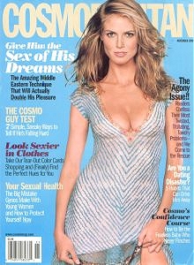
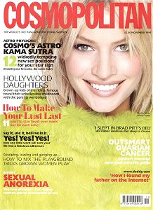
Nine American and British magazines were analyzed in terms of clutter. Clutter being defined using the general idea from above for the page layout but specifically for magazines including all advertisements. Clarity of typeface, font size, background and the overlapping of pictures and words were analyzed. The magazines used were the November 1999 issues of Time, BusinessWeek, Cosmopolitan, GQ, Esquire, Men’s Fitness, Shape, Heat, and People. The first seven publications have a British version under the same title. Heat is a British magazine that is similar to the American magazine, People. These magazines were chosen based on the most popularly read genres: business, women, men, fitness and entertainment magazines.
There were distinct differences between American and British magazines in the area of the cover page, the first 15 pages, the last 10 pages and the advertisements. All results are true for each genre of magazine unless specifically noted.
- Cover Page -
The front page of each British magazine compared to American cover pages:
More clear and precise typeface: British font type was much larger and the color choices of the words against the background color were more distinct. The words did not blend in, creating a distraction, as they did in the American versions.
Less words describing the feature stories inside the magazine. British magazines had about half the amount of blurbs on the cover.
Less overtaking of pictures and graphics. Many American magazines allowed the picture or graphic to be placed overtop the magazine’s name, whereas all British magazines had the magazine’s title overlap everything else on the cover. The British magazines made the title the focal point or important image of the cover page. American magazine's focal point was the picture or graphic.
 |
 |
American Edition |
British Edition |
- First Pages -
The first 2-5 pages of a British magazine are full page and two page ads. American magazines contain between 10 – 15 pages of ads before reaching the table of contents. Between articles this trend can be seen as well.
- Back Pages -
The last few pages of the men’s and women’s magazines in both the American and British version were filled with smaller, cheaper advertisements. There was a great difference in appearance. In American magazines, the ads were black and white with few pictures encompassing the last 10 pages with around 10 ads per page. The British magazines had around 10 pages as well, but with 20 ads per page. And yet, the British pages looked more open and were easier to read. The ads were smaller, in color, and there was more space between each ad giving a clearer, more open appearance.
- Advertisements -
The placement, size and number of ads in British magazines were quite different from that of American magazines. The two main areas of differences were on the pages and with stuffers.
Pages – The British magazines had a majority of full and two page ads. The American magazines had more broken pages between articles and advertisements. They used sidebars and the top or bottom of a page more often than in the British versions. The British Time and BusinessWeek had very little ads compared to the American versions. This was especially present inbetween articles.
Stuffers – These are single advertisements stuffed into the magazine. The British magazines were unusual in that they contained 6-10 loose paged ads as compared to only 2-3 in American magazines. They were different sizes, shapes and contents. They were for all types of products and services where as in the American magazines the stuffers were only for a subscription to the magazine.
Along with the loose ads, British magazines contained 10 pages of textured ads that differed from the texture of the regular pages. These were for a variety of companies. The American textured ads were always for perfume or music clubs using only 3-5 pages.
Free gifts were given with many British and American magazines. The British free gifts were quite different. Some included books, calendars, and purses/bags, as well as the usual cosmetics and accessories that come with the American magazines. The British gifts were larger and bulkier. They were distracting in that sense but they also took away from the important information, which is the magazine, itself.
![]() Methods/Results:
Newspaper
Methods/Results:
Newspaper
A combination of local, national and international newspapers from both the United States and the United Kingdom were used to analyze the comparative amount of clutter between those two countries.
The American Newspapers used for analysis were:
| NAME OF NEWSPAPER | TYPE | SPECIFIC ISSUES |
| New York Times | National | Fri. Oct. 22 / Tues. Nov. 2 |
| USA Today | National | Tues. Nov. 2 / Wed. Oct. 20 |
| Philadelphia Inquire | Local | Sun. Oct. 24 / Thurs. Oct. 21 |
| Philadelphia News | Local | Wed. Oct. 20 / Thurs. Oct. 24 |
The British Newspapers used as a comparison were:
| NAME OF NEWSPAPER | TYPE | SPECIFIC ISSUES |
| Herald International Tribune | International | Tues. Nov. 2 / Fri. Oct. 29 |
| The Financial Times | National | Tues. Nov. 2 |
| The Guardian | Local | Tues. Nov. 16 / Tues. Nov. 2 |
| The Independent | Local | Fri. Oct. 29 / Tues. Nov. 2 |
| The Daily Star | Local | Fri. Oct. 22 / Tues. Nov. 16 |
Clutter in newspapers took the form of visual aides (photographs, pictures, charts, graphs, etc.) when it was excessive and distracted the reader from the main focus. Advertisements, when there were more ads than print and photos and inserts (coupons, magazines, etc.), were clutter because they had nothing to do with the information given in the articles of a newspaper.
Presentation and layout of newspapers were generally the same. All consisted of two basic elements: articles and advertisements. The actual content and form of the elements varied.
The following is an analysis and comparison of the different forms of clutter found in British and American newspapers:
VISUAL AIDES
Many British newspapers showed a lack of coordination with visual aides and articles. Unrelated pictures/photographs were placed on a page of unrelated articles.
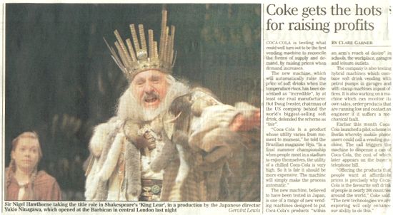
For example: In The Independent newspaper for Tuesday, October 29, 1999 a photograph of Sir Nigel Hawthorne performing in a Shakespearean play was placed on a page of unrelated articles (see below). There was not a reference to direct the reader where to find the connecting article because there was no article. The photo, which should have been placed in the Arts & Entertainment section, was found in the Local News section of the newspaper.
An excessive use of pictures for one article contributes to clutter. British newspapers tend to use several pictures similar to one another.
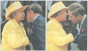
For example, in the Tuesday, November 2, 1999 issue of the Daily Telegraph three pictures (two are below) of Queen Elizabeth and Prince Charles were used for the same article - all similar to each other. An overuse of pictures tended to make up for a lack of information.
American newspapers tend to cram many articles onto one page leaving little space for visual aides. In effect, American newspapers try to fit very small photographs/pictures on the pages making them difficult to see and leaving little impact on the reader. On the contrary, British newspapers allow a bigger space for pictures making it clear to readers what it is they should see.
The majority of newspapers in the UK contain a single box comic on the front cover. These comics had no relation to any of the front cover stories and were often placed in the middle of an article making it unclear to the reader if it went with the article.
In conclusion, British newspapers contained a larger amount of clutter in the area of visual aides. Although the presentation of British newspapers tended to appear less crammed, under the definition of clutter the content of the visual aides and the appropriateness of the amount of visual aides via the articles was more cluttered than American newspapers.
ADVERTISEMENTS
A large amount of British newspapers had at least one advertisement on the cover page while US newspapers never displayed advertising on the front page. Advertising on the front page creates clutter and takes away from the cover stories.
British newspapers allowed more space and pages for advertisements while American newspapers tended to cram in a bunch of advertising. Through a random selection of newspapers, the amount of advertisements in British and American newspapers were counted as a rough sample to compare the amount of advertisements in each. It was concluded that the amount of advertisements in UK and US newspapers were comparatively equal.
In American newspapers the Arts &Entertainment section consisted of roughly 30 pages of advertisements for upcoming movies and plays. There is an estimated 10 articles in each edition. British newspapers only have about 5 pages for an entertainment section (if a section even exists) with much less advertisements.
In conclusion, American newspapers create more clutter with the placement and presentation of advertisements than British newspapers do.
INSERTS
US Newspapers have more inserts than UK newspapers. Most inserts are found in the US Sunday papers while inserts are very rarely found in British newspapers of any kind. Different types of inserts found in American newspapers include coupons, loose ads, and affiliated magazines (e.g. TV Week in the Philadelphia Inquirer, NY Times Book Review Magazine). These inserts created clutter because they took away from the information presented in the original newspaper.
![]() Methods/Results: Radio
Methods/Results: Radio
Four British radio stations were analyzed in terms of clutter. Radio clutter is any unorganized programming, commercials, or DJ talking. Because radio is a non-visual medium, clutter is hard to determine aside from personal preferences. In the research, the stations listened to were: Radio 1 (98.8), Radio 2 (89.1), Virgin (105.8) and Kiss (100). The listening times of most of these stations were in the morning, mid-day, early evening and late night. The research was done to see the difference, if any, in the amount of clutter in American radio compared to the amount of clutter in British radio.
There are many significant and procedural differences between American and British radio in terms of clutter. Research was done by listening to British radio and then making comparisons/contrasts to previous American radio listening experiences. Aspects listened for were radio programming, number of commercials and talking/cutting in over music.
British Radio:
· Had different radio programming
· Less music more commercial/talk
· Talked over music or cut song off
· Changed listening format
One of the major differences between radio in Britain and radio in America is the programming. The average American listens to the radio for music entertainment, like singing along in the car or while at work. Radio in America has a specific programming format aired on FM stations and AM stations. FM stations are listened to for music. It has more music less talk format, with the exception of Howard Stern. Anything that cuts into a music program was considered clutter. AM stations have a talk radio format; listeners turn on AM for different talk shows. Anything interrupting the talk show program was considered clutter. Talk programs are still the main focus on FM and AM stations in Britain. Radio 1 and Radio 2 have various talk programs throughout the day with music played in between, while Virgin and Kiss radio have broken away from the talk show format while playing more music. Most Americans would see this as clutter because British radio combines talk show programs with music playing in between, instead of having them separated with one on FM and one on AM.
More commercials are played for a longer duration on British radio. In an hour, music/talk programs run for 20-25 minutes, but then there will be 15 minutes of commercial breaks or DJ talking in between before another program begins. This is more prominent in Radio 1 and Radio 2. Virgin and Kiss radio have an average break time like in the U.S.
One thing British Radio has a tended to do is talk over a song or cut off the duration of the song. In America, we might cut the last 5-10 seconds of a song to go into another song. In Britain, the DJ will talk over the song or cut the song in the middle and start to play a new one. This happened probably 1-3 times an hour for every station that was listened to. It is somewhat of annoyance and its just clutter.
In America, when tuning into a specific station, we usually know what kind of music will be playing. In Britain, the kind of music played on a station changed throughout the day. In Britain, there is a radio guide showing music and programs that will be on for that day. In the morning you could be listening to pop on one station and then by night switch to classical. It’s a day by day thing so you never know what to expect.
![]() Methods/Results: Television
Methods/Results: Television
To analyze the amount of clutter on British television, three of the major television channels were observed at different times. Those channels were BBC 1, ITV, and Channel 4. They were taped for two hours in the morning, afternoon, and evening. The main focus was on news programs and game shows because it was easier to determine clutter on such programs. The following items were labeled clutter:
- advertisements
- station identification logos
- name bars
- photographs
- graphs
- clocks
It was then analyzed how many times and for how long these items appeared.
In general, all the channels had more clutter at night than any other time of day. All the news programs used name bars very briefly. Photographs and graphs were used sparingly in all cases. There was also a distinct difference between complimentary clutter and irrelevant clutter. Complimentary clutter was related to the focus, but distracted away from it. For example - the name bars. Irrelevant clutter were things that were distracting and had nothing to do with the focus. For example - the clock in the corner of the screen and id logos.
![]()
Due to its public service broadcasting background, BBC 1 had no advertisements. It did, however, use promotions of other BBC television, and even radio, programs. These were considered clutter, and it was noted that they were not as long as most commercials.
BBC1 used some graphics during its news programs. The name bars appeared for about three seconds and would sometimes include the person’s title or location. During live interviews, they had a logo that read BBC Live located in the upper left corner which stayed up for the entire interview. They also used Headline and Update bands whenever they were changing to a new story or set of stories, which stayed for about 4 seconds. During the night news, they made use of the station identification more, mostly when the anchors were sitting at the desk.
On the BBC 1 quiz show, aired in the middle of the afternoon, there was very little clutter. The only clutter that was shown was an occasional super-imposed graphic of contestants’ scores displayed near their faces when a close-up was done.
![]()
This channel had the most advertisements of the three channels. For every 15 minutes or so there was about three minutes of commercials. There would be several commercials in each break.
As for its news programs, ITV had more clutter. They used their station identification logo more than BBC 1. At night, the logo stayed up during the entire program, whereas during the day, the logo would not. For all ITV news programs, the name bars stayed up slightly longer, for about five seconds, and they were used more frequently.
On the quiz show, Who Wants to be a Millionaire, there was again the super-imposed images. Mostly, it was of the question the contestant was trying to answer and whenever he or she asked the audience, ITV super-imposed the image of the graph of how many people picked each answer. All this is complimentary clutter.

This channel was very similar to ITV in terms of clutter. One difference was in the amount of commercials. Channel 4 had fewer commercials less frequently. Another difference is the use of station id logos. Channel 4 uses it more frequently in all their programs.
U. S.
The news programs in the United States have more clutter due to the many times they will have sports scores running across the bottom of the screen. The name bars are also used more frequently and are up longer. For foreign correspondents where they had no footage of the event they would also use pictures or maps of the area.
For quiz shows, Jeopardy, they would super impose scores and questions much more. For all programs, the station id logos are used more often, it is on practically all the time, except during commercials. As for commercials, there are longer time blocks more frequently, for every half-hour program there is at least ten minutes of commercials.
Conclusions
An inconsistency was found within the results of the four different mediums. The results are distinguished between the actual amount of clutter and the way in which it is presented in the layout.
Most Clutter |
Reason |
| American Television | Cluttered programming |
| British Radio | Cluttered programming |
| British/American Magazines (equally) | British more clutter/ American cluttered appearance |
| British/American Magazines (equally) | British more clutter/ American cluttered appearance |
![]()